
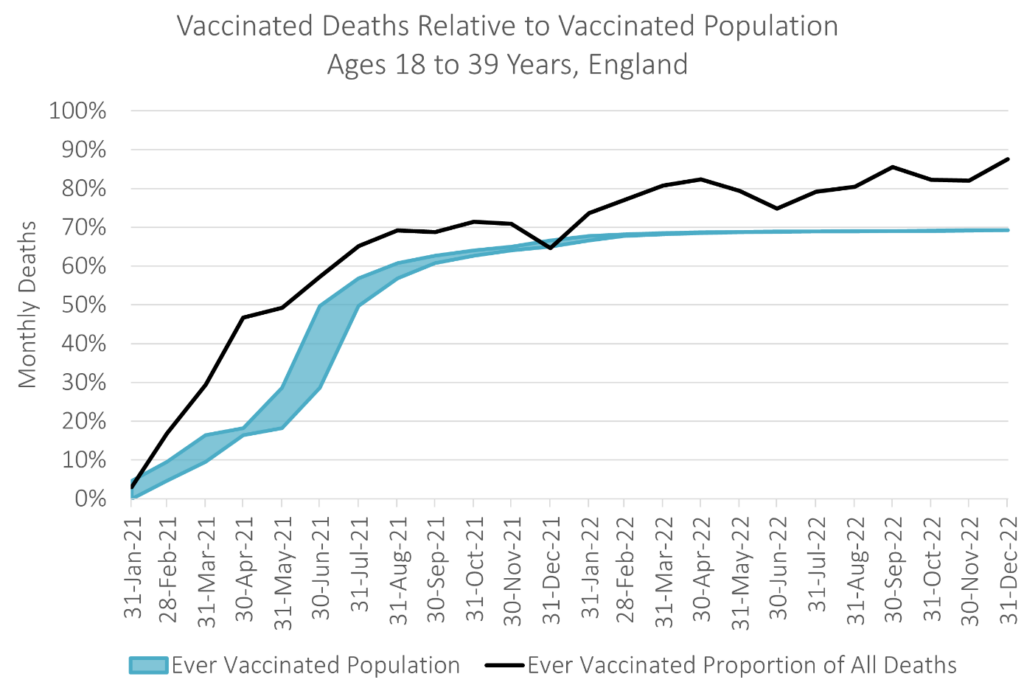
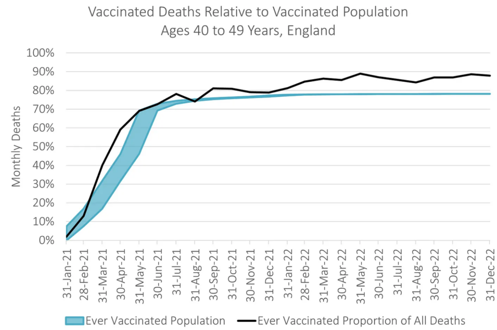
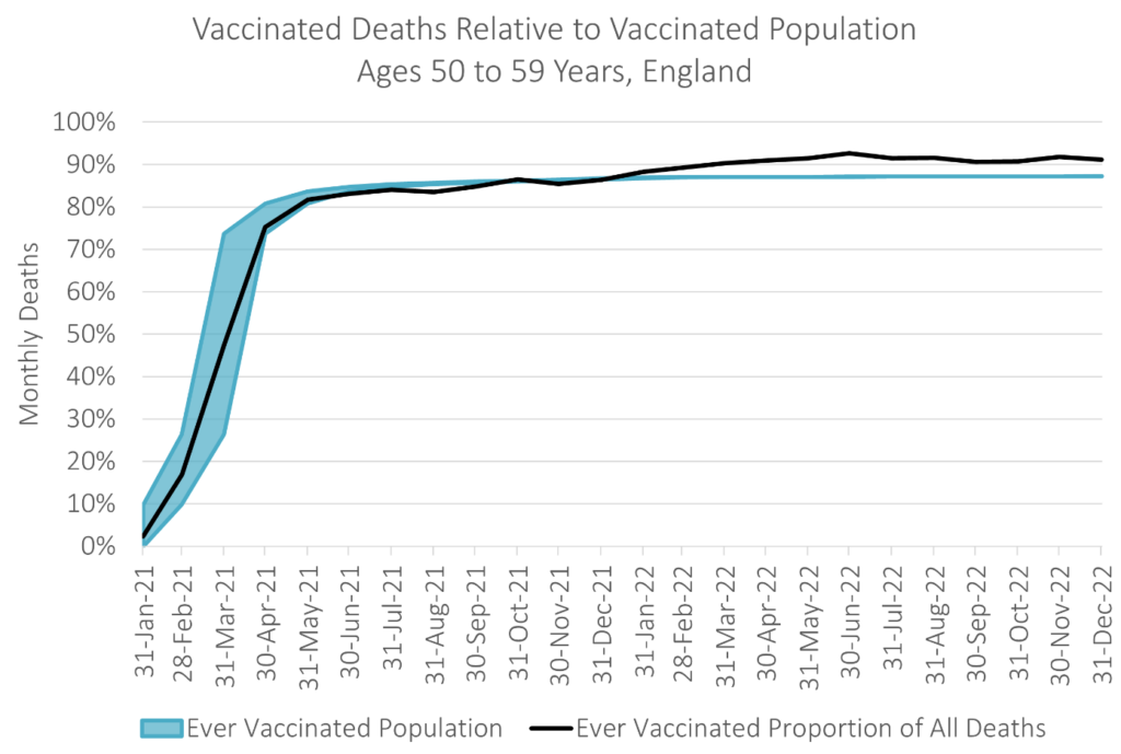
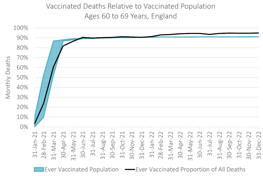
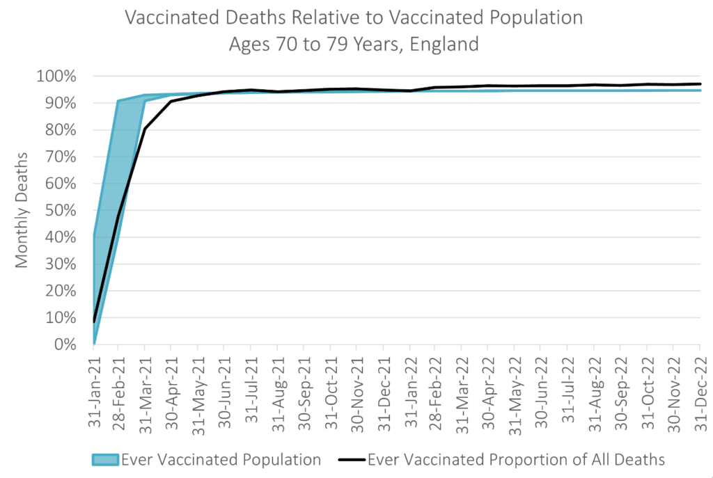
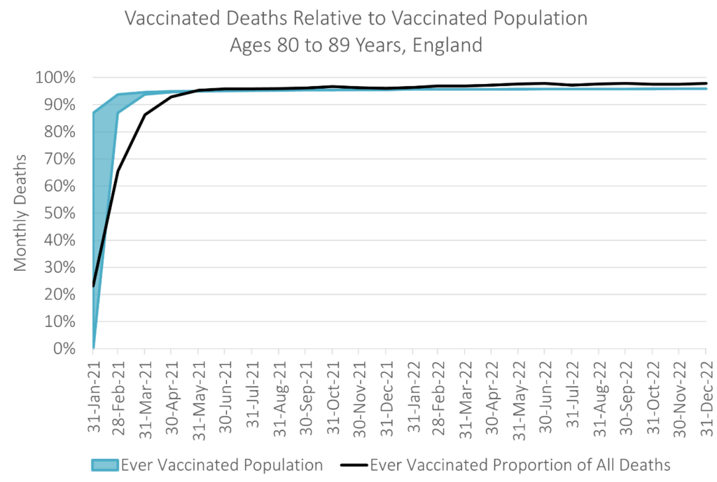
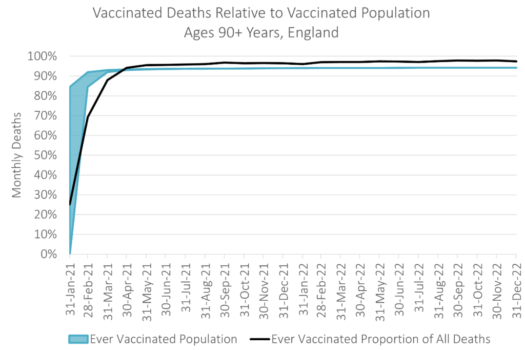
(The Daily Sceptic) — The new official data on deaths by vaccination status in England were released on February 22 by the Office for National Statistics (ONS) and they show the vaccinated are over-represented in all-cause mortality in all age groups for most of 2021 and all of 2022.
The charts showing this, produced by Joel Smalley, are reproduced below. While confounders cannot be excluded with these data, it would also be fair to say that they are hardly indicative of a protective effect, particularly given the healthy vaccinee bias which means vaccinated people are usually healthier on average than unvaccinated people.
I should note that there appear to be some serious issues with the ONS data that need to be addressed. In particular the population estimates seem very low, particularly for the unvaccinated.
Linked to this, while all deaths appear to be included, the population data only include individuals registered on the census. Since the unvaccinated are less likely to be registered on the census, this will artificially increase the death rate in the unvaccinated population.
There are also some missing data which Dr. Clare Craig has pointed out to the ONS and which officials have said they will address (UPDATE: The dataset has now been corrected on these particular points). The data have also changed since the last release, with the May 2022 data point that showed parity between vaccinated and unvaccinated death rates now altered. The reason for this is unexplained though may be due to a reporting lag.
Dr. Sarah Caul from the ONS tweeted out a graph showing the age-standardised mortality rate (per 100,000 person-years) over 2021 and 2022 by vaccination status, split into COVID and non-COVID deaths.
We were planning on including information on spring and autumn boosters but we currently do not have access to the data. We therefore decided to publish rather than wait for the data (5/10)
— Sarah Caul (@SarahCaul_ONS) February 21, 2023
In theory this is a very useful graph. Of course, the flaws in the data (such as skewed population estimates) mean we can’t really be sure how useful it is. But it’s still worth looking at it more closely.
Caul notes that “throughout the time series those unvaccinated had a higher age-standardized COVID-19 mortality rate than those who had had any vaccination.” She seems to be implying that this means the vaccines are benefitting people, and this is the message many have taken away.
The Mail, for instance, ran a story headlined: “Death rates are NOT higher among Covid-vaccinated Brits, according to official stats debunking major anti-vaxx myth.” It claims: “Mortality levels were actually higher among the unvaccinated.”
However, that is not the correct message of these data or this chart. Rather, their main message is that the data are biased, though there does also appear to be a signal of elevated non-COVID deaths in the vaccinated.
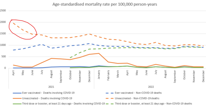
The first thing to note is that downward slope in April to June 2021 in the unvaccinated non-COVID deaths. Why were the unvaccinated dying so much of non-COVID causes in April, and why did they stop dying so much by June?
There are two prime suspects for this. First, the “moribund unvaccinated effect” (also known as one form of the “healthy vaccinee effect”) whereby those close to death are not vaccinated, temporarily elevating the death rate in the unvaccinated. Alternatively, it may be a miscategorization issue, whereby the vaccinated who die shortly after vaccination are counted as unvaccinated.
I tend to favour the former, but whichever it is, it is surely an artefact of some kind.
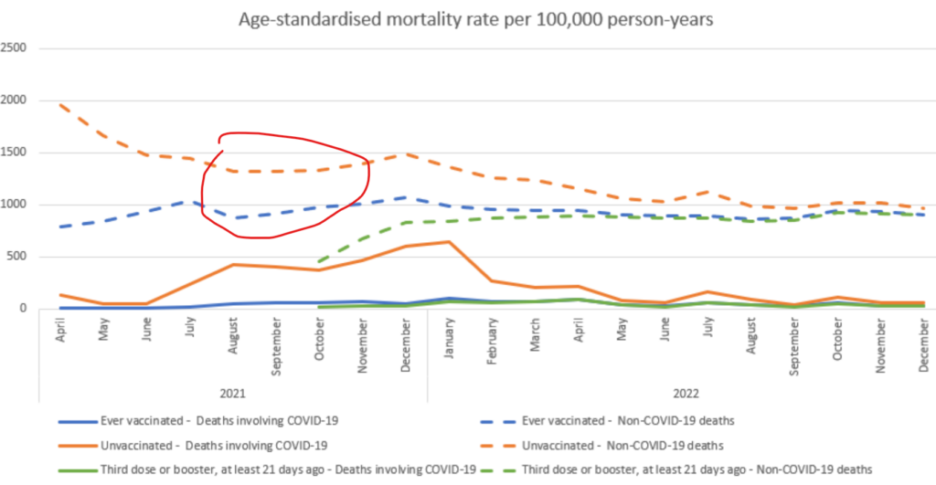
The second point to note is that once the unvaccinated non-COVID death rate stabilizes in June, it remains significantly above that of the vaccinated during 2021, at around 40–50 percent higher. This means that the unvaccinated are dying of non-COVID causes at a rate up to 50 percent higher than the vaccinated.
Since the vaccines cannot elevate the death rate of the unvaccinated, and assuming they are not miracle drugs that “cure all that ails you,” this is evidence of heavy bias. It may be a healthy vaccinee bias or a population estimate issue (as Igor Chudov argues), but once again it is an artefact confounding comparisons between vaccinated and unvaccinated.
Since the gap between vaccinated and unvaccinated COVID deaths (solid orange and blue lines) is on a similar scale, this raises questions about how much of that difference is also bias.
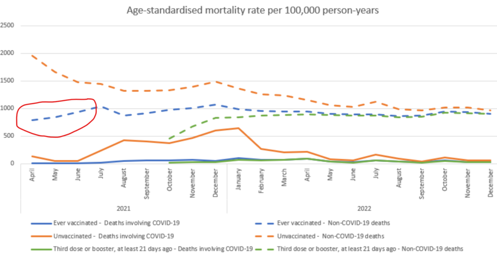
The next thing to note is that conspicuous rise in death rate in the vaccinated from non-COVID causes between April and July 2021, to around 30 percent higher, where it then largely remains. This is not simply the reverse of the decline in the unvaccinated death rate in the same period described above because the elderly vaccinated population is much larger than the elderly unvaccinated population by this point, so the relatively few missing deaths will not have a significant impact on reducing the death rate.
Instead, this seems to be a real rise in the non-COVID mortality rate of the vaccinated. This makes sense as it corresponds to when non-COVID excess deaths first rose in mid 2021. A comparison between the mortality rate in April 2021 (around 750) and April 2022 (around 950) is particularly striking. What we could do with is a baseline showing the normal mortality rate for England so we can see whether these rates are elevated compared to that, but that has not been provided.
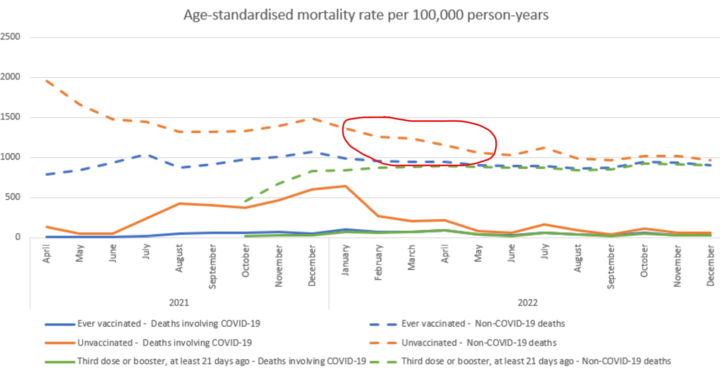
The next thing to note is the drop in the non-COVID death rate in the unvaccinated in the first half of 2022, by around 30 percent. Why do the unvaccinated become much less likely to die over this short period? It is not explained and I have no suggestions either, but such a huge improvement in the health of a cohort does need some kind of account; it is presumably an artefact of some kind.
Responding to queries on Twitter, Caul simply stated that: “More research would be needed, [it] could be based on the characteristics of those likely to be vaccinated/unvaccinated.”
After June the non-COVID death rates for vaccinated and unvaccinated become similar, but the reason they have converged – due to the vaccinated rate increasing and the unvaccinated rate mysteriously decreasing – remains under-explored.
Two further anomalies worth noting are that the July 2022 heat wave oddly seems to affect only the unvaccinated, and the sharp rise in deaths in December 2022, seen in the weekly ONS deaths data, is completely absent here, though the latter may be due to a reporting lag.
Neither of these things instils confidence in the data. The fact that the chart is age-adjusted rather than split by age is also unhelpful as there are serious doubts about the suitability of the age-adjustment model for the pandemic period.
All-in-all, we are limited in what can be drawn from these data, though the rise in the vaccinated non-COVID death rate in spring 2021 seems to match the rise in excess deaths in the same period and is a possible signal of concern.
I’ll leave you, as promised, with Joel’s graphs, showing for each age bracket how the vaccinated are over-represented in all-cause deaths for much of 2021 and all of 2022. These use raw data and NIMS population data so are unaffected by some of the issues noted above.
Reprinted with permission from The Daily Sceptic.